| From: | Corey Huinker <corey(dot)huinker(at)gmail(dot)com> |
|---|---|
| To: | Peter Geoghegan <pg(at)bowt(dot)ie> |
| Cc: | Jeremy Schneider <schnjere(at)amazon(dot)com>, Jürgen Purtz <juergen(at)purtz(dot)de>, Peter Eisentraut <peter(dot)eisentraut(at)2ndquadrant(dot)com>, PostgreSQL Hackers <pgsql-hackers(at)postgresql(dot)org> |
| Subject: | Re: Syntax diagrams in user documentation |
| Date: | 2019-03-29 02:53:38 |
| Message-ID: | CADkLM=cBiWtzPBrMxi5jAeYeRu71Q_2CQ_nhp8Oje3OYNiJ=nQ@mail.gmail.com |
| Views: | Whole Thread | Raw Message | Download mbox | Resend email |
| Thread: | |
| Lists: | pgsql-hackers |
On Thu, Mar 28, 2019 at 6:49 PM Peter Geoghegan <pg(at)bowt(dot)ie> wrote:
> On Thu, Mar 28, 2019 at 3:46 PM Jeremy Schneider <schnjere(at)amazon(dot)com>
> wrote:
> > We're just gearing up for the Google Season of Docs and I think this
> > would be a great task for a doc writer to help with. Any reason to
> > expect serious objections to syntax diagram graphics in the docs?
>
> It might be hard to come to a consensus, because it's one of those
> things that everybody can be expected to have an opinion on. It
> probably won't be hard to get something committed that's clearly more
> informative than what we have right now, though.
>
> There is a question about how we maintain consistency between the
> syntax diagrams in psql if we go this way, though. Not sure what to do
> about that.
>
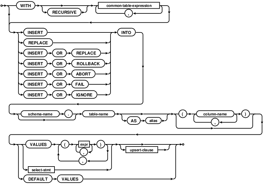
This discussion is highly relevant to an upcoming talk I have called "In
Aid Of RTFM", and the work I hope would follow from it.
While I personally like these bubble charts because they remind me of my
misspent youth at IBM, they have some drawbacks:
1. They look like something out of an IBM manual
2. Images conceal information from visually impaired people
3. They aren't copy paste-able text
4. They aren't easily comparable
5. They bake in the language of the comments
The merits of #1 can be argued forever, and it's possible that a more
modern bubble chart theme is possible.
#2 is problematic, because things like ADA compliance and the EU
Accessibility Requirements frown upon conveying text inside images. The way
around this might be to have the alt-text of the image be the original
syntax as we have it now.
#3 is important when attempting to relay the relevant excerpt of a very
large documentation page via email or slack. Yes, I could right click and
copy the URL of the image (in this case
https://www.sqlite.org/images/syntax/insert-stmt.gif and others), but
that's more work that copy-paste. We could add an HTML anchor to each image
(my talk discusses our current lack of reference anchors) and that would
mitigate it somewhat. Making the original text available via mouse-over or
a "copy text" link might work too.
#3b As long as I live, I will never properly memorize the syntax for RANGE
BETWEEN UNBOUNDED PRECEDING AND CURRENT ROW. I will google this and
copy-paste it. I suspect I'm not alone. If it's available only in an image,
then I can't copy paste, and I *will* mistype some part of that at least
twice.
#4 isn't such an immediate issue, but one of my points in the talk is that
right now there is no way to easily distinguish text on a page that is new
in the most recent version of pgsql (i.e. a red-line markup). We could of
course flag that an image changed from version X-1 to X, but it would be
tougher to convey which parts of the image changed.
#5 it not such a big issue because most of what is in the diagram is pure
syntax, but comments will leak in, and those snippets of English will be
buried very deep in bubble-markup.
| From | Date | Subject | |
|---|---|---|---|
| Next Message | Amit Langote | 2019-03-29 02:55:48 | Re: Misleading errors with column references in default expressions and partition bounds |
| Previous Message | Tsunakawa, Takayuki | 2019-03-29 02:30:20 | RE: Timeout parameters |