> On Tue, Jul 9, 2019 at 3:22 PM Tatsuo Ishii <ishii(at)sraoss(dot)co(dot)jp> wrote:
>>> I agree that the existing colors look awful, and that muted pastel
>>> colors would work better. Doesn't seem like something that should
>>> happen at the cost of making the diagram less informative, though.
>> I am not an expert in the area but I think we should cosider people
>> with color disability.
> Good point. I think that that shouldn't be too hard to mostly get right.
>
> It's good that the diagrams will already work with a screen reader.
>
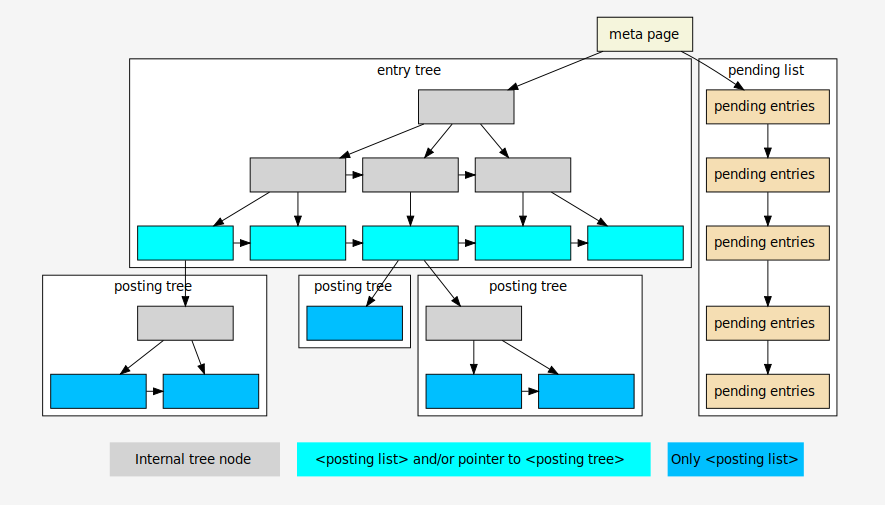
Due to the discussions of recent days as well as some improvements of
the graphiz know-how, the graphic is subject to many changes: different
colors (variations of 'PG blue', and possibly helpful for people with
color vision deficiency), a different font (adaption to the font in PG's
documentation), changes in the meaning and explanation of nodes (as a
result of discussion with Oleg Bartunov), introduction of a - hopefully
unobtrusive - background color (to circumvent graphic from text), use of
DOT syntax.